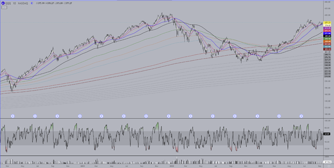
Before I start with EZ’s list I’m going to post a compressed daily interval chart of QQQ and use it to explain how to use my system of MA’s, which may initially look nuts (as there are 25 total) but I think it won’t be too hard to see the logic in them. They work particularly well for Nasdaq futures and QQQ and many Nasdaq stocks, but they work pretty well for just about everything.
Remember you can right click on any image and have it show up enlarged in a new window. This chart covers the 2020 Covid low through today. They work pretty well. I’m not going to share the MA’s because they are something I worked on for well over a decade which only just came together about 2 yrs ago.
There are 10 colored MA’s and a total of 15 grey MA’s which aren’t all up on this chart. The grey’s usually don’t come into play on the longer time frames unless we’re in a bear market and things have sold off quite a lot. They tend to work very well on the daily time frame for finding bottoms. On shorter time frames they can be used to pinpoint tops and bottoms of moves.
The ten colored MA’s should be viewed in 3 subgroups. The two browns are the longest of the colored MA’s and they are my “bull/bear” indicators. When anything is trading above both of these then it is usually to be looked at as long term bullish. Below both of these MA’s is long term bearish.
The next subgroup consists of the green, light blue, and yellow MA’s. They will tend to be areas of support/resistance in the midst of larger trending moves. You can see how they played this role in the beginning of the downtrend early in 2022. They played a bit of a resistance role in the beginning of 2023 just before QQQ moved completely back above the two brown MAs.
For some equities the green can also play the role that the black MA plays, which is my MA of last resort for trends. What this means is, and you can see this in the chart, during a trending move the black MA (and sometimes the green) is where the deepest pullbacks will go to during trending moves. If that MA loses support it often means the trend is done and a deeper pullback/change of trend is beginning. You can see on this chart in July 2022 where the black MA was breached during a counter trend rally and it went to and a little above the green before continuing the down trend.
The last subset of MA’s are the shortest and are white, violet, red and blue. These MA’s indicate the strength of a trend and help to give an early head’s up to watch for trend reversals. It’s hard to see on this compressed chart but you can see how well these MA’s work as support/resistance during trending moves.
In conjunction with this daily chart I also use monthly, weekly, and an 8hour ETH chart which shows the pre/after hours trading and is very useful when paired with the daily chart.
Btw, I do remember that in the past I have shared that the black MA is the 130 MA, so there’s a gift for you all. You can actually use this single MA to do pretty well trading QQQ and many Nasdaq stocks in particular. If any of you do use it, it is not a terribly well known MA so it would be wise to keep it secret, since the more popular any tool gets the more it tends to lose it usefulness.
