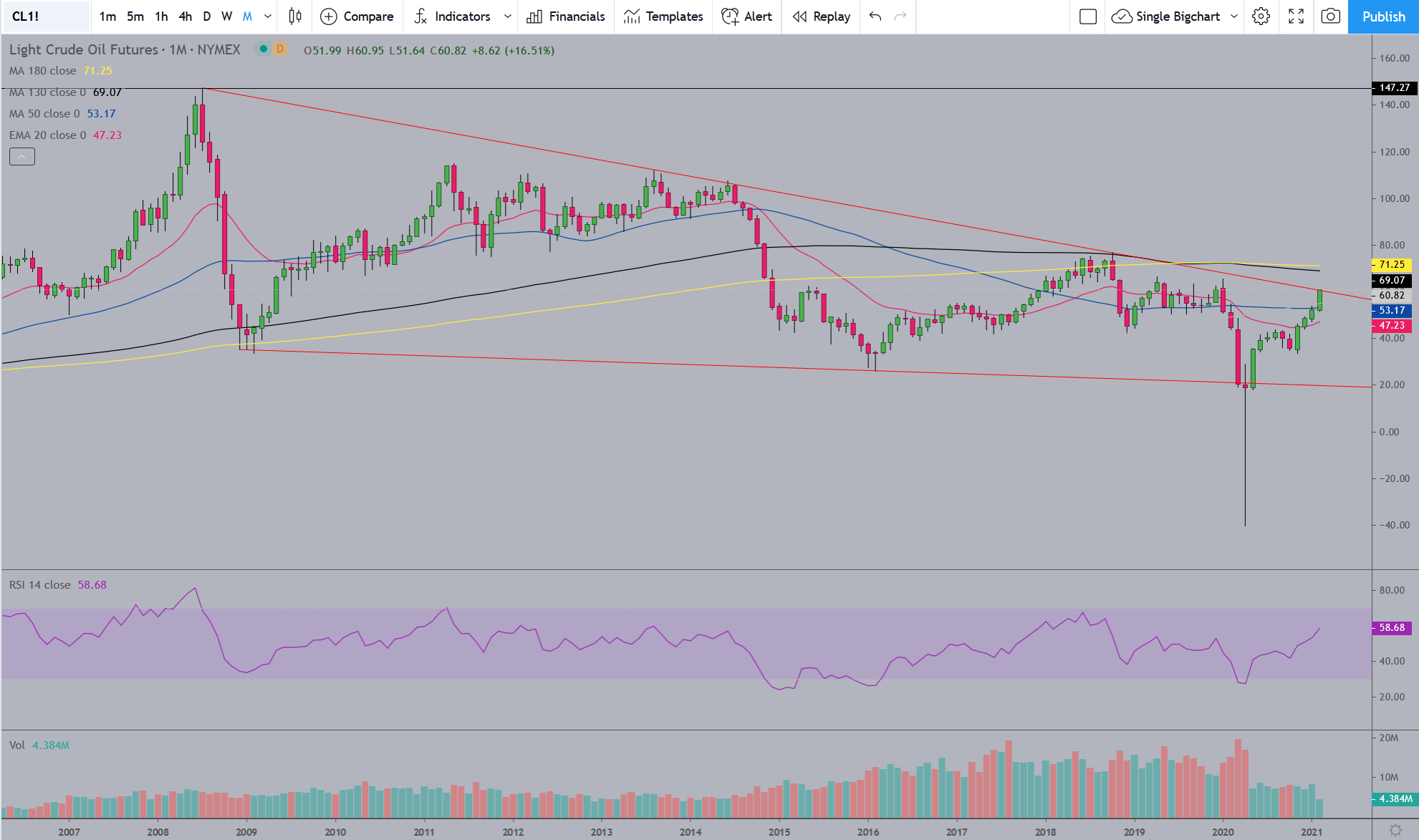
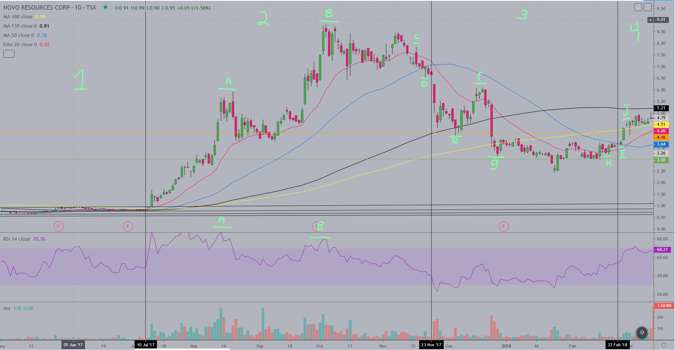
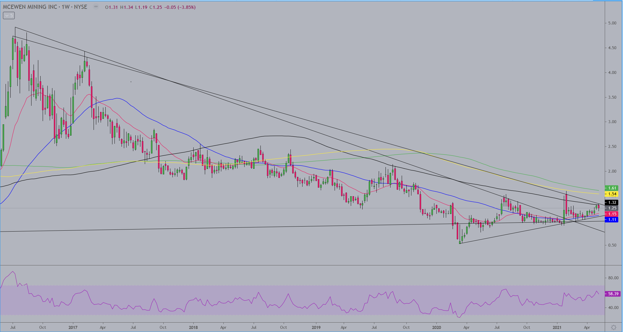
I created a bit of a charting lesson for someone so thought I would share it here for anyone interested…
This chart is a daily interval broken into 4 sections from left to right. It is not the current activity but runs from May '17 to March '18. The first section NVO is in a consolidation. The second section covers the bull run and the beginning of the bearish period. The third section covers the confirmation and continuation of the bearish period. The fourth section shows the beginning stages of what ended up as a new but short lived bull run. The moving averages on the chart are the 20ema (red), 50ma (blue), 130ma (black), 180ma (yellow). (There are two horizontal lines, orange and green, running through the chart which don’t have anything to do with this). The only thing to note about the first section is that there is a long period of consolidation going on with NVO here and the 130 and 180 MA’s are the resistance point for the entire consolidation period.
The second section begins the breakout. Note that the 20ema first crosses above the two longer MA’s, followed by the 50ma. Note also that, as the stock rises, the 20ema is solid support, for the most part, up to and a little beyond the “B” area on the chart. There are a few days when the 20ema support is broken and a few times the candles even close below the 20ema, but they are always very close to the 20ema and recover quickly back above it within a day or two, never showing any kind of strong selling until just after the highs are hit at “B”. The 20ema often is the area of first support when a stock is in a strong bull run, and the first area of resistance when a stock is in a strong bear run. When a stock is in a long bull or bear run, eventually there will be days of heavier selling and the 20ema will be broken. This is where the 50ma can be helpful to keep you in the trade and not miss out on a potential next leg higher. Watch for retracements to find support/resistance at the 50ma and then move back to the 20ema and continue the trend.
From the start of section 2 up to the highs marked by “B”, NVO is in a strong uptrend, never getting close to the 50ma. There is an early signal on the chart though, once the highs at “B” are confirmed by a small retracement back to the 20ema, to warn you that the bull run might be over. You can see that “A” on the chart marks the first highs NVO hits before a retracement to the 20ema. At the bottom of the chart there is another “A” marking the level the RSI indicator hit at the corresponding price highs. Now you can see at “B” that NVO clearly hit new price highs, but the RSI at that point did not hit a new high. This is called bearish divergence and is the earliest way I know of to get an indication that a trend may be ending. In this case it did indeed indicate the end of the bull run for NVO. The next indication the bull run was over was in the price action just before “C”, where NVO appeared to be ready to start the next push higher, but failed and, at “C” finally lost the support of the 20ema, tested the 50ma and then lost that support which is confirmed at “D”.
Now we’re at section 3, where we aren’t yet bearish but now watch to see what the stock does at the 130 and 180ma’s. In regards to the moving averages, regardless of the time frame I use them on, and I use them on every time frame I look at and use them the same way, I always use the 20ema and 50ma (and sometimes the 30ma as well) as gauges of the strength of a trend. When a trend is strong, those three MA’s will hold the price movement. I use the 130 and 180ma the way most use the 200ma, as overall indicators of bullish/bearishness. If a stock is under the 130 and 180 then to me they are bearish. I am either looking to short them or waiting for either a bottom formation and other indications of a potential bottom, and/or I’m waiting for the price action to get back above them and hold as support, at which time I again become bullish on the stock.
So at “D” NVO has lost the support of both the 20ema and 50ma. Two days later the selling intensifies, note the 20ema crossing down over the 50ma at that time, and the price action goes down to the 130ma and bounces a bit, then at “e” goes lower and penetrates the 130ma support. It holds there for a couple days and makes a move back above the 20ema at “F”. There are a few reasons not to get bullish here at “F”, but from the perspective of the moving averages the 20ema is under the 50ma, and price has not gotten near the 50ma, and you want to at least have price break back above the 50ma and hold as support before even thinking about getting bullish again. I also use trend lines and some other tools to help make those decisions and don’t depend solely on the MA’s. From the highs at “F” the bearish trend, which is now confirmed due to the failure of price to recover back to the high at “c”, continues and busts strongly through the 130ma and heads straight to the 180ma, and then breaks the 180 support at “g”. From there the selling volume drops off and the stock drifts slowly down in a consolidation which continues to the area on the chart labeled “I”. The area marked “H” indicates an early indication of potential bullishness for a few reasons: 1. The dip in price just prior to “H” held a support level and did not meet or exceed the previous low which I didn’t mark but you can see pretty much dead center between “g” and “H”. 2. Price broke above the 20ema just before “H” and pulled back to hold support at the 20ema. 3. The 20ema at the point of “H” has flattened from it’s downward trend and is just starting to turn upward again, while the 50ma has caught up to it and is also beginning to flatten. At “I” price breaks above the 50ma, hits a slightly higher high than the previous week of trading, and ends up closing above the 50ma. At “J” you have a break above the 180ma and consecutive days of the 180ma holding as support. From there what you can’t see is that price eventually breaks back above the 130ma and makes a mildly bullish run for a few months before another breakdown.